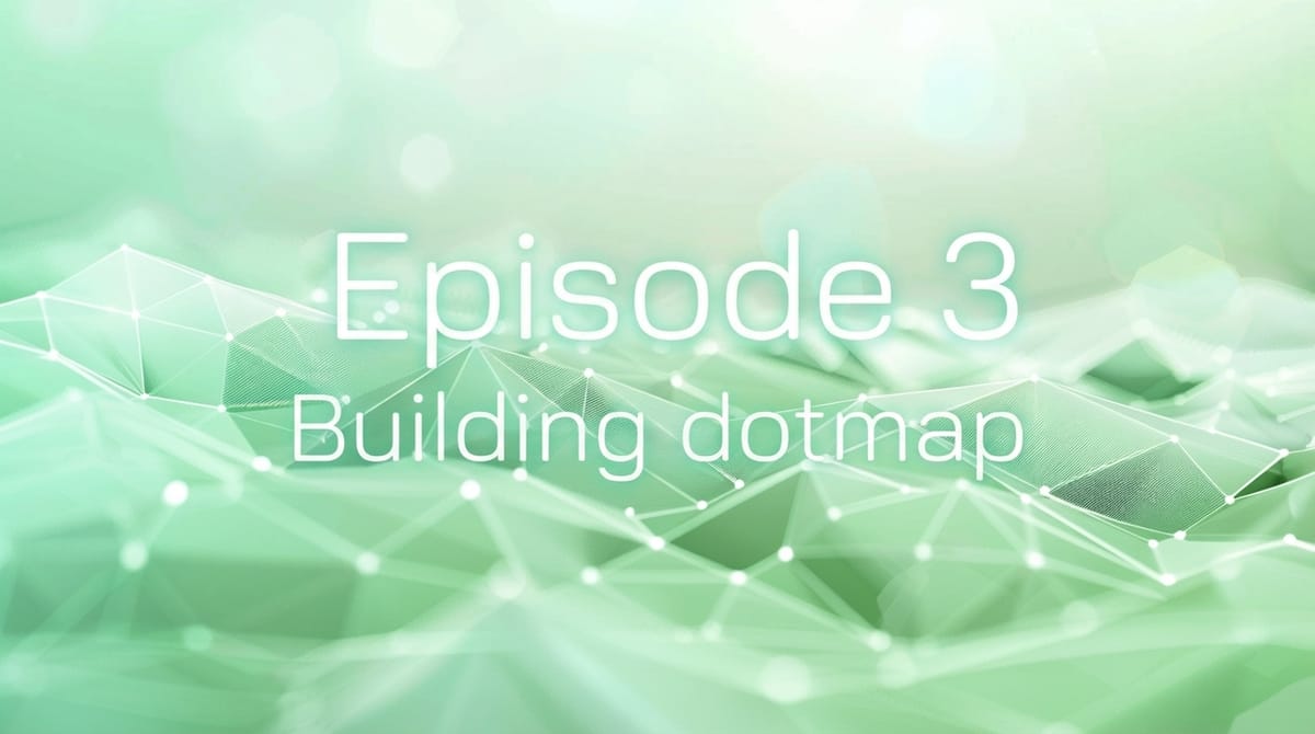
Episode 3 — A map-first way to explore tech
Episode 3 explores why dotmap is built around a map-first experience. A simple, visual way to discover professionals and events without feeds, complexity or algorithms — just intuitive exploration.

Choosing a map as the centerpiece of dotmap wasn’t a design trend or a technical experiment.
It was a philosophy: discovery should feel natural.
Instead of lists, filters, sorting options and recommendation engines, the map gives you something simpler:
A landscape.
Zoom out, and you see the global tech ecosystem.
Zoom in, and you’re inside a city’s talent pool.
Move around, and you discover clusters of skills, roles and events.
It’s a calm, intuitive way to navigate a noisy world.
Markers that represent people, not profiles
Every professional appears as a marker — either with a photo or clean initials.
There’s no ranking, no popularity score, no “top profiles.”
Everyone has equal visibility by default.
When many people overlap, the map groups them into clusters, showing where activity gathers naturally.
Opening a cluster feels like zooming into a neighborhood full of specialists you never knew existed.
Events woven into the same world
Unlike traditional platforms, events aren’t isolated pages.
They sit on the same map, side-by-side with the people who might attend them.
You might zoom into a city and discover:
- a meetup next week
- a workshop nearby
- a tech conference two streets over
- professionals located around the venue
It gives context you don’t get from a static event listing.
An experience built around exploration
dotmap is intentionally designed without:
- infinite feeds
- recommended posts
- algorithmic smoothing
- pop-ups pushing engagement
Discovery happens in the mind of the user, not in the logic of the platform.
This means:
- You explore at your own pace
- You decide what matters
- You follow spatial cues, not engagement cues
It feels more like wandering through a city than scrolling through an app.
A modern interface that stays out of the way
dotmap uses a single-page interface to make every interaction feel instant:
- moving around the map
- opening a profile
- filtering by skill
- switching between professionals and events
The UI is minimal because the content — real people and real activity — is what should stand out.
Next episode
Episode 4 looks at the early days of building the MVP — including what worked, what didn’t, and the choices that shaped the first version of dotmap.
All episodes
- Episode 0 - Building dotmap
- Episode 1 - Why I started building dotmap
- Episode 2 — Designing the concept

I offer hands-on consulting to help you resolve technical challenges and improve your CMS implementations.
Get in touch if you'd like support diagnosing or upgrading your setup with confidence.