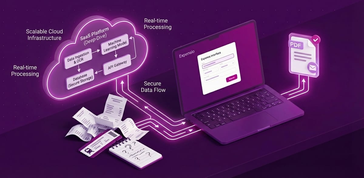
Expensio Update - February 2026
Another month, another round of Expensio changes. This one was mostly about making the app feel faster and less annoying to use on a daily basis.


Dashboard redesign
The old dashboard was fine. It showed your expenses. That's about it.
The new one lets you filter by period: week, month, quarter, year, or everything. There's a donut chart for category breakdown now. And the onboarding checklist that used to take up half the screen is compact enough that it doesn't get in the way once you know what you're doing.
I went back and forth on whether to add charts at all. Expensio is supposed to be simple, and charts feel like the first step toward "analytics bloat." But seeing where your money goes at a glance turned out to be useful enough to justify it. One chart. That's the line.
PDF exports got way faster
PDFs were the slowest part of Expensio. You'd click export, stare at a spinner, and eventually get your file. Not great.
I moved PDF generation to Cloudflare Browser Rendering. The export now runs in the background. You see a progress indicator, and the download starts automatically when it's done. On a typical report, generation went from several seconds to under one.
This also fixed a bug where your company logo wouldn't show up in exports. Cloudflare's rendering engine handles remote images differently, and I had to rework how logos get embedded. One of those "simple bug, annoying fix" situations.
Email your claims
You can now send a claim as a PDF attachment by email, directly from the claim screen.
Before this, the workflow was: export PDF, open email client, attach file, type something, send. Now you hit one button and it's gone. Boring? Sure. But I use this weekly and the old flow was annoying enough that I kept putting it off.
Download PDF and CSV from the claim screen
Same idea as email. Previously you had to navigate to the export page to download a PDF or CSV. Now there are download buttons right on the claim screen.
Less clicking, fewer page loads, faster workflow. These are small wins, but they're the ones people actually notice.
Side panels instead of separate pages
This is probably the change that affects daily usage the most.
Creating and editing expenses used to take you to a separate page. You'd fill in the form, save, and navigate back to the list. Every. Single. Time.
Now it all happens in a side panel. The list stays visible. You edit inline. No navigation, no context switching. If you're logging ten expenses after a business trip, the difference is night and day.
I applied the same pattern to templates. Anything that used to be a full page detour is now a panel that slides in from the right.
What's next
Recurring expenses. I keep logging the same office rent and subscriptions every month. That should be automatic. Also need to look at query performance before the dataset grows enough to care.
Expensio is free at expensio.app. Feedback welcome — I actually read it.

I offer hands-on consulting to help you resolve technical challenges and improve your CMS implementations.
Get in touch if you'd like support diagnosing or upgrading your setup with confidence.
Read more
If you want to know more about Expensio, read the blog series: